Choose Mailchimp if you want quick, friendly responsive email templates. Choose HubSpot if you want email design tied to sales, CRM, and deeper automation. Both can build mobile-ready emails. They just feel built for different teams.
TLDR: Mailchimp is easier for fast newsletters, promos, and simple campaigns. HubSpot is stronger when emails connect to contacts, deals, lead scoring, and sales follow-up. For example, a small shop sending 4 campaigns a month could save about 2 hours with Mailchimp’s simpler builder, while a B2B team with 10,000 contacts may get more value from HubSpot’s tracking and CRM data. If 45% to 60% of your opens are on mobile, responsive templates are not optional. They are survival.
Why responsive email design matters
Your email has one tiny job. It must look good everywhere.
That means on a big desktop screen. On a tablet. On a cracked phone screen at 7:43 a.m. while someone drinks coffee and ignores three meetings.
Responsive email design makes your layout adjust to screen size. Text stays readable. Buttons stay tappable. Images do not explode off the screen like they are trying to escape.
Bad mobile emails hurt. People pinch. They zoom. They sigh. Then they delete.
A responsive template usually includes:
- Single-column layouts for phones.
- Large buttons for thumbs.
- Readable font sizes, often 14px to 18px.
- Images that resize without breaking the layout.
- Short subject lines that do not get chopped in the inbox.
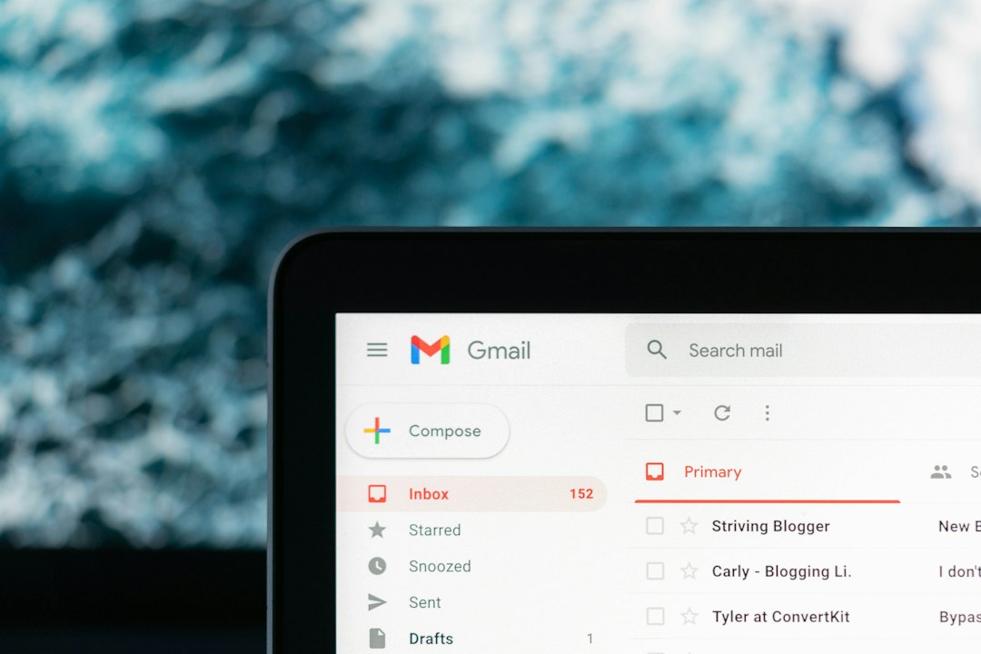
Mailchimp: the friendly email kitchen
Mailchimp feels like a bright kitchen with labeled drawers. You can walk in, grab a template, change the colors, add your logo, and send a campaign.
That is the charm.
Its responsive email templates are simple to edit. The drag-and-drop builder is easy to understand. Add text. Add image. Add button. Move blocks around. Done.
Mailchimp is great for:
- Small businesses.
- Creators and bloggers.
- Online shops.
- Simple newsletters.
- Seasonal promotions.
- Teams without a designer.
Mailchimp templates usually behave well on mobile. You can preview desktop and mobile views before sending. This is useful because email clients can be weird little goblins.
Honestly, it feels like Mailchimp was built for people who just want to get the email out before lunch.
What Mailchimp does well
- Fast setup: You can pick a template and customize it in minutes.
- Clean blocks: Text, image, button, divider, and product blocks are simple.
- Mobile preview: You can check how things stack on smaller screens.
- Good ecommerce options: Product recommendations and promo blocks are handy.
- Beginner-friendly editing: You do not need to know HTML.
What gets annoying
Mailchimp can feel limiting when you want complex layouts. Some template edits take more clicks than they should. Expect to waste time on spacing if your design has many sections.
The reporting is useful, but it is not as deep as HubSpot when you connect emails to a full sales process. Mailchimp tells you who opened and clicked. HubSpot can show how that action fits into a contact’s larger journey with your company.
HubSpot: the email command center
HubSpot is not just an email tool. It is a full marketing and sales platform. That changes the whole feel.
HubSpot email templates are responsive too. You can use drag-and-drop editing. You can preview emails on desktop and mobile. You can also test different email clients, depending on your plan and features.
But the real power is the connection to the CRM.
HubSpot is great for:
- B2B companies.
- Sales teams.
- Marketing teams with longer funnels.
- Lead nurturing.
- Personalized campaigns.
- Companies that track contacts from first click to closed deal.
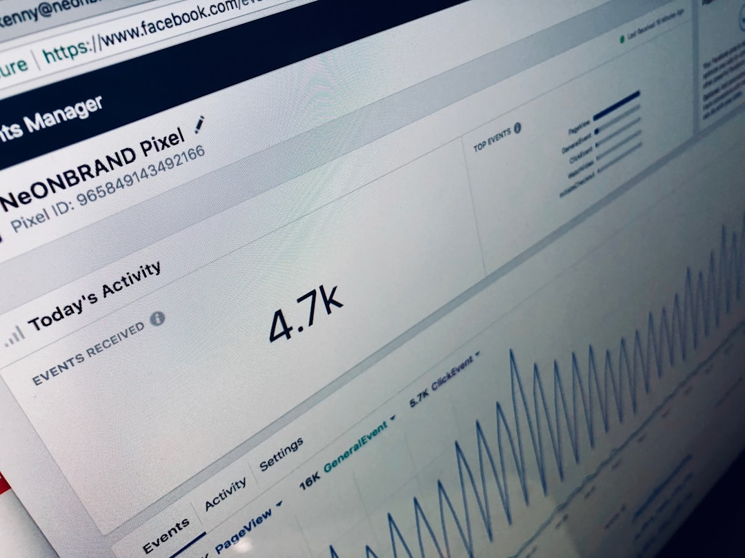
Let’s say someone downloads a guide. Then they visit your pricing page twice. Then they click a case study in an email. HubSpot can track that behavior inside the contact record. Your sales team can see it. Your next email can respond to it.
That is where HubSpot shines.

What HubSpot does well
- CRM connection: Email data links to contacts, companies, and deals.
- Personalization: You can use contact properties in email content.
- Automation: Workflows can send emails based on behavior.
- Testing tools: You can check performance and improve campaigns.
- Team visibility: Marketing and sales can see the same contact activity.
What gets annoying
HubSpot can feel like a spaceship when all you need is a bicycle. There are menus inside menus. A simple email can take longer if your account has many settings, lists, workflows, and permissions.
It drives me crazy that tiny setup choices can slow down a quick campaign. A marketer may spend 20 extra minutes checking lists, subscription types, smart rules, and workflow triggers before hitting send.
That control is useful. But it is not always fun.
Template design: who wins?
Mailchimp wins for speed. Its templates are easy to browse. They look polished enough. You can create a nice email without calling a designer or crying into your keyboard.
HubSpot wins for strategy. Its templates support more complex marketing systems. You can build emails that react to contact data and sales activity.
Here is the plain version:
- Need a simple newsletter? Pick Mailchimp.
- Need lead nurturing tied to sales? Pick HubSpot.
- Need pretty promos fast? Pick Mailchimp.
- Need segmentation based on CRM data? Pick HubSpot.
- Need lower stress? Mailchimp is usually easier.
- Need more control? HubSpot gives you more tools.
Mobile editing and previews
Both tools let you preview emails on mobile. Use this every time. No excuses.
Desktop emails can hide problems. Mobile exposes them. A three-column layout may stack badly. A button may be too small. A hero image may crush the first message below the fold.
Mailchimp makes this quick. Preview, adjust, send a test. Done.
HubSpot gives more testing options, especially for teams that care about details across devices and clients. This is helpful, but it can feel heavier.
A simple rule works for both tools:
- Keep one main call to action.
- Use short paragraphs.
- Make buttons at least 44px tall.
- Use clear alt text for images.
- Test on a real phone before sending.

Pricing and team fit
Mailchimp usually makes more sense for smaller teams with basic email needs. You can start simple and grow into more features.
HubSpot often costs more, especially when you need advanced automation, reporting, or larger contact limits. But the price can make sense if your emails help sales close deals.
Think about your real use. Not your dream use. Many teams buy huge platforms and then send one newsletter a month. That is like buying a food truck to make toast.
Best choice by user case
- A bakery: Mailchimp. Send weekly specials with photos and coupons.
- A fitness coach: Mailchimp. Send tips, offers, and class updates.
- A SaaS company: HubSpot. Send onboarding emails based on product interest.
- A real estate team: HubSpot. Track leads, listings, calls, and follow-ups.
- An online store: Mailchimp if needs are simple. HubSpot if sales cycles are longer.
Final verdict
Mailchimp is the better pick for simple responsive email templates. It is quicker, lighter, and easier for non-technical users.
HubSpot is the better pick for responsive email templates connected to a bigger growth system. It takes more setup, but it gives you richer contact data and stronger automation.
If your main question is, “Can I make a good mobile email fast?” choose Mailchimp.
If your main question is, “Can this email help sales know who is ready to buy?” choose HubSpot.
Either way, test on mobile. Keep it short. Make the button obvious. Your readers are busy. Their thumbs are impatient.