A strong logo is often the first visual handshake between a business and its audience. It can communicate professionalism, personality, trust, and positioning in a matter of seconds. While a logo may look simple when finished, the path from early concept to polished brand identity requires research, strategy, creativity, testing, and careful refinement.
TLDR: A professional logo begins with a clear understanding of the brand, its audience, and its market position. The design process moves from research and concept development to sketching, digital refinement, typography, color selection, and final delivery. A successful logo should be simple, memorable, scalable, versatile, and aligned with the larger brand identity.
Understanding the Purpose of a Logo
A logo is not simply decoration. It is a strategic brand asset that helps an organization become recognizable and memorable. It may appear on websites, packaging, signage, business cards, social media profiles, advertisements, uniforms, invoices, and mobile apps. Because of this, a logo must work across many environments without losing clarity or impact.
Professional logo design focuses on meaning as much as appearance. A designer does not create a symbol just because it looks attractive; the final mark should reflect the character, values, and promise of the brand. For example, a law firm may require a logo that feels stable, refined, and trustworthy, while a children’s toy brand may need something colorful, playful, and energetic.
The strongest logos often share several qualities:
- Simplicity: The design is easy to recognize at a glance.
- Memorability: The logo remains in the viewer’s mind after only brief exposure.
- Relevance: The style matches the brand’s audience, industry, and personality.
- Scalability: The logo remains clear whether it appears on a billboard or a small app icon.
- Versatility: The design works in color, black, white, print, and digital formats.
- Timelessness: The logo avoids relying too heavily on short-lived trends.
Starting with Brand Discovery
Before visual exploration begins, the brand must be understood. This stage is sometimes called brand discovery or creative briefing. It helps define what the business stands for, who it serves, and how it wants to be perceived.
A designer typically examines the brand’s mission, values, audience demographics, competitors, tone of voice, and long-term goals. This research prevents the logo from being based only on personal preference. Instead, every creative choice becomes connected to a strategic reason.
Important discovery questions may include:
- What problem does the business solve?
- Who is the ideal customer?
- What emotions should the brand create?
- Which competitors occupy the same space?
- Should the brand feel premium, friendly, innovative, traditional, bold, calm, or playful?
- Where will the logo be used most often?
This information forms the foundation of the design direction. Without it, the logo may look attractive but fail to communicate the right message.
Studying the Audience and Competition
A logo should appeal to the audience rather than only to the business owner or designer. A luxury skincare brand, for instance, may need refined typography, soft space, and subtle color. A sports nutrition company may benefit from stronger shapes, dynamic lines, and high-energy contrast.
Competitor research is equally important. By studying the visual language used in the industry, a designer can identify patterns and opportunities. If most competitors use blue and gray, a carefully chosen alternative color may help the brand stand out. If every company uses similar icons, a more distinctive wordmark may be the stronger solution.
The goal is not to copy what others are doing. The goal is to understand the market so the logo can feel both appropriate and distinctive.
Choosing the Right Logo Type
Different brands require different logo structures. A professional designer considers which type best supports recognition and usage. Common logo categories include:
- Wordmark: A text-based logo using the brand name, often with custom typography. This approach is useful when the name is distinctive.
- Lettermark: A logo built from initials or abbreviations, often used by organizations with long names.
- Symbol or brand mark: A standalone icon that represents the brand visually.
- Combination mark: A pairing of text and symbol, offering flexibility for different applications.
- Emblem: Text placed inside a badge, seal, or crest, often used for heritage, education, food, or community brands.
A new business often benefits from a combination mark because the audience can connect the symbol with the name. Over time, if the brand becomes highly recognizable, the symbol may be used independently.
Moving from Ideas to Sketches
The sketching stage is where abstract strategy becomes visible. Designers often begin with quick, rough sketches rather than polished artwork. This allows many ideas to be explored quickly without becoming attached to one solution too early.
Sketches may investigate shapes, initials, symbols, metaphors, layout, rhythm, and negative space. A technology brand might explore circuits, grids, motion, or abstract connections. A sustainable food company might explore leaves, farms, circles, seeds, or natural textures. However, the most effective idea is not always the most obvious one. Subtle visual metaphors often create more original results.
At this stage, quantity matters. A designer may generate dozens of directions before selecting a few promising concepts. The strongest ideas are then refined and translated into digital form.
Building the Logo Digitally
After sketches are reviewed, selected concepts are recreated as vector artwork. Vector design is essential for professional logo creation because it can be scaled to any size without losing quality. This means the same logo can appear on a small label or a large building sign while remaining sharp.
Digital refinement focuses on proportions, spacing, balance, alignment, curves, and consistency. Small adjustments can make a major difference. A letter that is slightly too wide, an icon that feels off-center, or uneven spacing between words can make a logo appear less professional.
During this stage, designers often test several versions:
- Horizontal layout
- Stacked layout
- Icon-only version
- Single-color version
- Reversed version for dark backgrounds
- Small-size version for favicons or social icons
Selecting Typography
Typography plays a significant role in brand perception. A serif typeface can feel established, editorial, or elegant. A sans serif typeface can feel modern, clear, and efficient. A script typeface may communicate creativity or luxury, while a bold geometric font may suggest strength and confidence.
Professional logo typography often involves customization. A designer may adjust letter spacing, modify certain characters, or create custom letterforms so the wordmark becomes unique. This helps prevent the logo from looking generic or easily replicated.
Readable typography is especially important. If the brand name cannot be understood quickly, the logo loses effectiveness. Decorative fonts should be used with care, particularly for businesses that need clarity across small digital spaces.
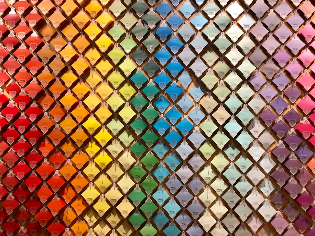
Using Color with Intention
Color can influence emotion, recognition, and brand association. Blue often suggests trust, security, and professionalism. Green may connect with health, nature, growth, or sustainability. Red can feel energetic, urgent, or passionate. Black may communicate sophistication, authority, or simplicity. Yellow can feel optimistic and warm.
However, color meaning can change depending on culture, industry, and context. A professional designer avoids choosing colors only because they are attractive. Instead, color is selected to reinforce the brand strategy and improve recognition.
A logo should also work without color. If the design depends entirely on a gradient or complex color effect, it may fail in practical applications such as engraving, embroidery, stamps, or black-and-white printing. This is why many professional logo presentations begin in monochrome before color is introduced.
Creating a Complete Brand Identity
A logo is the centerpiece of visual identity, but it is not the entire brand. A professional brand identity includes a broader visual system that supports consistency across every customer touchpoint. This system may include color palettes, typography rules, icons, photography style, illustration style, layout principles, patterns, and tone of voice.
For example, a café logo may be supported by warm colors, hand-drawn illustrations, textured paper, friendly copywriting, and cozy photography. A financial technology company may use clean layouts, precise icons, cool colors, and confident messaging. In both cases, the logo works best when surrounded by a consistent visual language.
Brand guidelines help protect this consistency. They explain how the logo should and should not be used. Guidelines often include spacing requirements, minimum sizes, approved color codes, typography rules, incorrect usage examples, and file format instructions.
Testing the Logo in Real Situations
A logo should never be judged only on a blank white screen. It must be tested in realistic environments. A designer may place the logo on mockups such as business cards, website headers, packaging, storefront signs, social media avatars, vehicle graphics, or uniforms.
This testing reveals practical problems. A thin line may disappear at small sizes. A complex symbol may become unclear on fabric. A long horizontal logo may not fit well into a square profile image. A color combination may lack contrast on certain backgrounds.
Effective testing helps ensure that the final design is not only beautiful but also functional.
Image not found in postmetaRefinement and Feedback
Feedback is a normal part of the logo design process. However, useful feedback should be connected to strategy rather than personal taste alone. Comments such as “make it pop” or “it does not feel right” are less helpful than feedback explaining what seems unclear, inappropriate, or misaligned with the brand personality.
A professional designer filters feedback through the original brief. If a suggested change strengthens the brand message, it may be worth exploring. If it weakens the concept or creates practical issues, the designer should explain why another direction may be better.
Refinement may involve adjusting proportions, simplifying shapes, improving contrast, changing typography, or testing alternative color palettes. The final logo should feel intentional, resolved, and ready for long-term use.
Preparing Final Logo Files
Once the design is approved, the logo must be prepared in the correct formats. This is a key part of professional delivery. A business should receive files suitable for both print and digital use.
Common final file types include:
- AI or EPS: Editable vector source files for professional use.
- SVG: Scalable vector format for websites and digital interfaces.
- PDF: Useful for sharing and print production.
- PNG: Transparent background file for digital use.
- JPG: Standard image file for general use when transparency is not needed.
The final package may include full-color, black, white, horizontal, vertical, and icon-only versions. Proper organization helps the brand use the logo correctly from the beginning.
Common Logo Design Mistakes
Several mistakes can reduce the effectiveness of a logo. One common issue is overcomplication. Too many details, colors, effects, or symbols can make the logo difficult to remember and hard to reproduce. Another mistake is following trends too closely. A highly trendy logo may look outdated within a short time.
Poor typography is another frequent problem. Unbalanced letter spacing, generic fonts, or unclear wordmarks can weaken the overall identity. Low contrast, unsuitable colors, and lack of scalability can also cause issues across different media.
A successful logo does not need to explain everything about a business. It needs to provide a clear, memorable, and appropriate visual identity that can grow with the brand.
Conclusion
Logo design is a structured process that blends creativity with strategy. From discovery and competitor research to sketching, typography, color, testing, and final file delivery, each stage contributes to a stronger result. A professional logo should represent the brand clearly, function across many platforms, and remain useful for years.
When a logo is built on a thoughtful concept and supported by a complete brand identity, it becomes more than a graphic. It becomes a recognizable symbol of trust, value, and connection between the business and its audience.
FAQ
What makes a logo professional?
A professional logo is simple, memorable, scalable, versatile, and strategically aligned with the brand. It should work across print and digital platforms and remain clear in different sizes and color formats.
How long does the logo design process usually take?
The timeline varies depending on research, complexity, feedback, and revisions. A thoughtful logo design process may take anywhere from several days to several weeks.
Should a logo include a symbol?
Not always. Some brands are best represented by a strong wordmark, while others benefit from a symbol or combination mark. The right choice depends on the brand name, audience, industry, and usage needs.
Why should a logo work in black and white?
A black-and-white version ensures the logo remains functional in situations where color is unavailable or impractical, such as stamps, embroidery, engraving, photocopies, and certain print applications.
What files should a business receive after logo design?
A complete logo package should usually include vector files such as AI, EPS, SVG, or PDF, along with digital formats such as PNG and JPG. Multiple color and layout variations are also useful.
How often should a logo be redesigned?
A logo should not be redesigned too frequently. A refresh may be appropriate when the brand changes direction, looks outdated, merges with another company, or no longer connects with its audience.