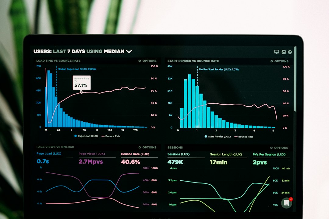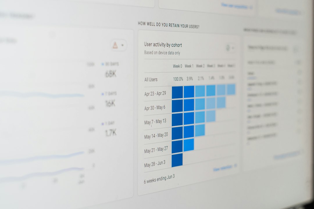
Choose HubSpot if email buttons must tie directly to sales, CRM data, and deeper reporting; choose Mailchimp if you need fast, clean button design for newsletters, offers, and simpler campaigns. Both tools can create effective email buttons, but they serve different teams. Mailchimp is easier for quick visual work. HubSpot is stronger when a button click needs to trigger follow-ups, scoring, sales alerts, or segmented reporting.
TLDR: Mailchimp is usually better for teams that want to build attractive email buttons quickly without a heavy setup. HubSpot is better when button performance must connect to contact records, sales activity, and automation. For example, a software company sending a trial offer to 12,000 leads might see a 17% button click rate in HubSpot and instantly route high-value clicks to sales, while a retail brand may prefer Mailchimp to launch a discount email in under 30 minutes. If your main question is “which button got clicks,” Mailchimp is enough; if the question is “which clicks created revenue,” HubSpot is the safer bet.
Email Buttons Matter More Than Most Teams Admit
An email button is not just decoration. It is the main action point. It tells the reader what to do next: buy now, book a demo, confirm attendance, download the guide, or start free trial.
Small design choices affect results. Button color, copy, size, spacing, placement, and mobile behavior can change click rates. A vague button like “Learn More” often performs worse than a specific button like “Get the Pricing Sheet.” Serious email teams test these choices instead of guessing.
This is where Mailchimp and HubSpot differ. Mailchimp focuses on speed and visual simplicity. HubSpot focuses on data, automation, and buyer behavior. Neither is perfect. The right choice depends on how much control and reporting you need after the click.
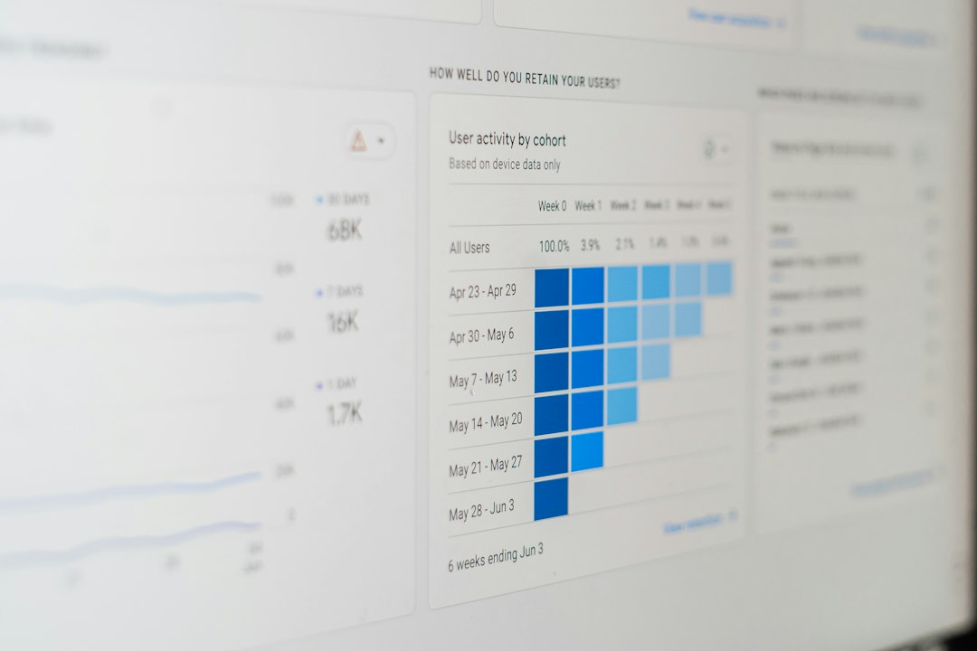
Mailchimp: Fast Button Design for Practical Campaigns
Mailchimp is the better choice when you want to design a clear email button without fighting the tool. Its drag-and-drop editor is simple. You add a button block, change the text, set the link, pick the color, adjust alignment, and move on.
For small businesses, creators, ecommerce teams, and nonprofit senders, that simplicity matters. You can make a button that looks professional without needing a designer or developer. Mailchimp also gives you enough control over styling, including:
- Button text, such as “Shop the Sale” or “Reserve My Seat”
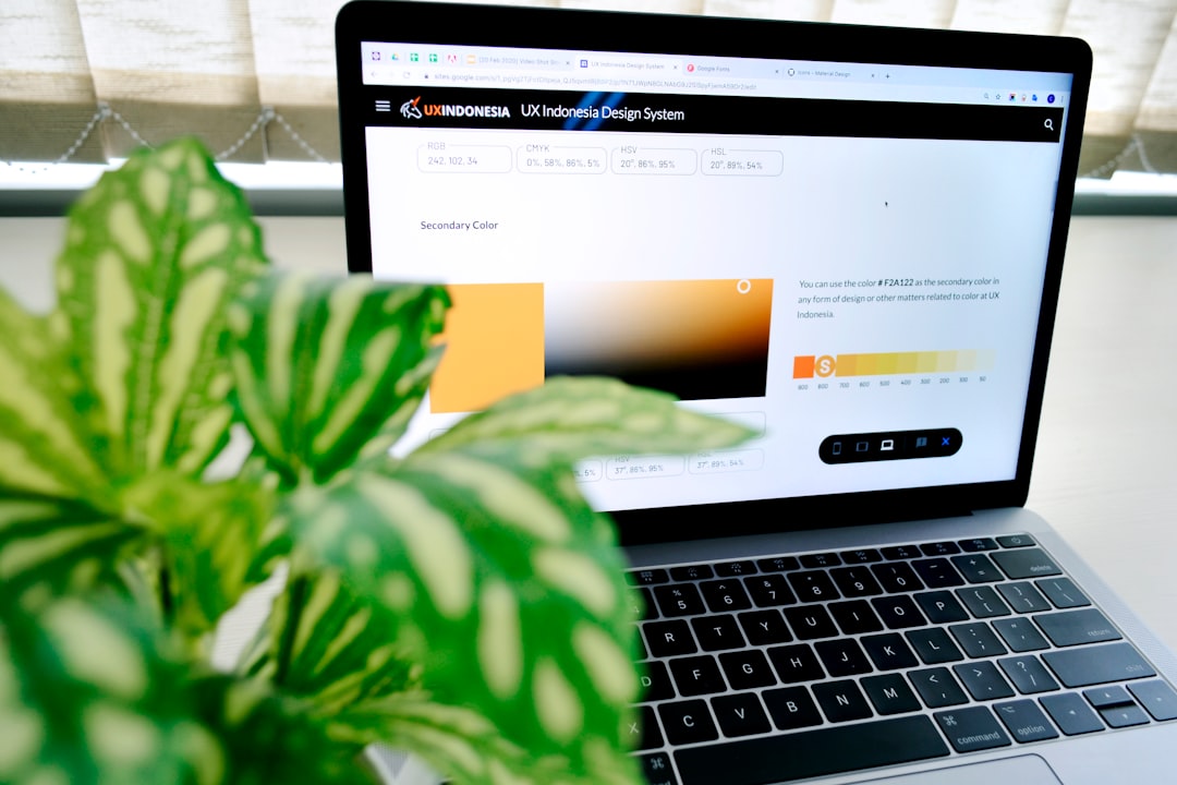
- Background color and text color
- Border radius for square or rounded buttons
- Alignment, including left, center, and right
- Padding and spacing around the button
- Links to pages, products, forms, or downloads
Mailchimp is especially good for visually polished campaigns. Ecommerce promotions, seasonal offers, newsletters, launch emails, and event reminders are all natural fits. If your goal is to send a strong email with one or two clear actions, Mailchimp keeps things manageable.
The annoyance is that Mailchimp can feel limited once you want deeper behavior tracking. You can see clicks, but tying those clicks to complex buyer stages or sales activity takes more work. Honestly, it feels like Mailchimp wants you to stop at campaign reporting, even when your team needs more context.
HubSpot: Better Buttons for Revenue Tracking and Automation
HubSpot’s email button tools are also easy to use, but the real value sits behind the design. A HubSpot button can connect directly to CRM records, workflows, lifecycle stages, lead scoring, lists, and deal activity.
That matters for B2B teams, sales-led companies, agencies, SaaS brands, and any business with a longer buying cycle. A button click is not just a click. It can signal intent. HubSpot lets you act on that signal.
For example, a contact who clicks “Request a Demo” can be added to a workflow, assigned to a sales rep, moved to a hotter segment, or sent a follow-up email. A contact who clicks “View Case Study” can receive related content two days later. These actions can happen without manual sorting.
HubSpot button design options include:
- Standard CTA buttons inside marketing emails
- Personalized button experiences based on contact data
- A/B testing on higher-tier plans
- CRM-based reporting tied to contacts and companies
- Workflow triggers based on clicks
- Campaign attribution for revenue and pipeline analysis
The trade-off is setup time. HubSpot can feel heavy if all you need is a simple newsletter button. Expect to waste time on settings if your account is not organized. A task that takes 20 seconds in Mailchimp can take a few minutes in HubSpot when properties, lists, and tracking rules are involved.
Image not found in postmetaDesign Control: Which Tool Gives Better Email Buttons?
For pure design speed, Mailchimp wins. Its editor is friendly and focused. You can build attractive buttons quickly, and the preview tools make it easy to check desktop and mobile layouts.
HubSpot is still solid, but it is more structured. That structure helps with brand consistency and reporting. It can also slow down creative work. If your team likes tight control over templates, modules, and brand rules, HubSpot may feel safer. If your team wants to make a campaign fast, Mailchimp feels lighter.
Neither platform removes the need for good button design principles. A poor call to action will still fail. A button should be easy to spot, easy to tap, and easy to understand.
Best Practices for Email Buttons in Both Platforms
Whether you use Mailchimp or HubSpot, the core rules stay the same. Strong buttons are clear, specific, and visually separate from the rest of the email.
- Use action words. “Download the Report” beats “Click Here.”
- Keep text short. Two to five words is usually enough.
- Make the button large enough. Mobile readers need tap-friendly spacing.
- Use contrast. The button should stand out from the background.
- Place the first button high. Do not make readers hunt for the action.
- Repeat the button when needed. Long emails often need a second call to action.
- Match the button to the promise. If the email offers a guide, the button should say “Get the Guide.”
Avoid stacking too many buttons in one email. Multiple calls to action can confuse readers. One primary button usually performs better than three competing choices.
Analytics: Mailchimp Clicks vs HubSpot Attribution
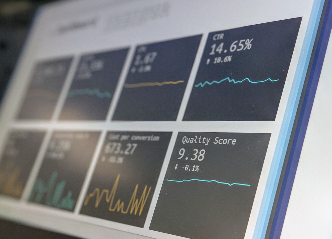
Mailchimp reporting is clear and useful for campaign-level review. You can track open rates, click rates, clicked links, audience activity, and basic ecommerce results if connected properly. For many teams, this is enough.
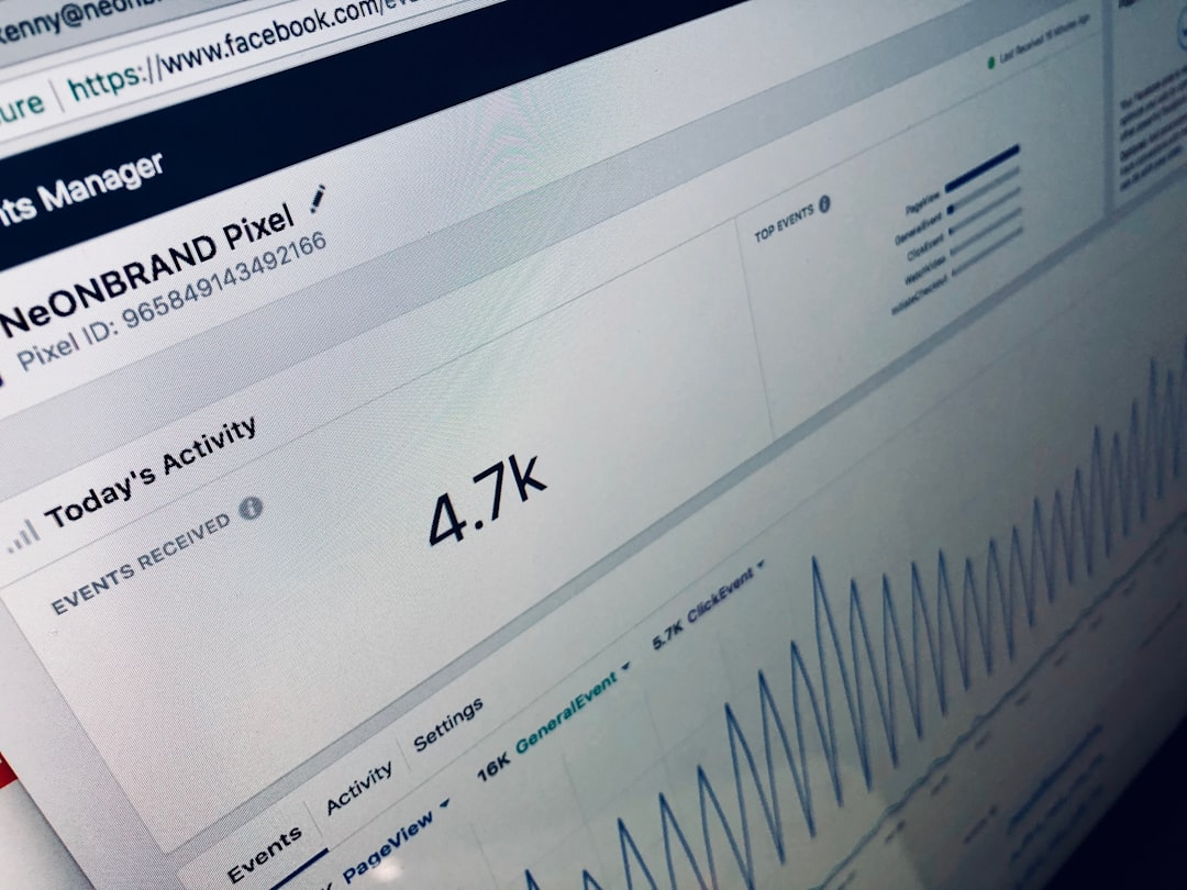
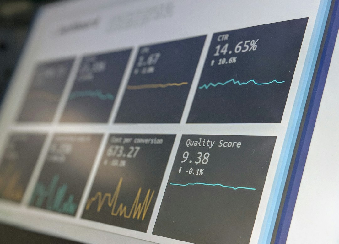
HubSpot reporting goes further. It can show how button clicks relate to contacts, lifecycle stages, campaigns, forms, meetings, deals, and revenue. This is a major difference. If a button drives 400 clicks, Mailchimp can show that activity. HubSpot can help show whether those clicks came from qualified leads, existing customers, or accounts with active deals.
Consider this simple case. A consulting firm sends 8,000 emails promoting a strategy session. Mailchimp reports a 14% click rate, or 1,120 clicks. That is useful. HubSpot reports the same clicks but also shows that 86 came from target accounts, 31 booked meetings, and 9 became sales opportunities worth $74,000 in pipeline. That changes the conversation.
When Mailchimp Is the Better Choice
Pick Mailchimp if your team values speed, ease, and clean visual editing. It is well suited for newsletters, product announcements, content emails, event invites, simple promotions, and audience updates.
Mailchimp is also a smart fit when your team does not need a full CRM connection. If you mostly care about opens, clicks, unsubscribes, and campaign performance, Mailchimp keeps the work simple. Less setup means fewer mistakes.
When HubSpot Is the Better Choice
Pick HubSpot when button clicks need to feed sales, automation, or account-based reporting. It is better for lead nurturing, demo requests, gated content, onboarding paths, customer expansion, and complex conversion tracking.
HubSpot is also stronger when several teams need the same data. Marketing can see campaign performance. Sales can see contact activity. Managers can see pipeline impact. That shared view is hard to match with Mailchimp alone.
Final Verdict
Mailchimp is best for designing effective email buttons quickly. It is simpler, cleaner, and easier for day-to-day campaigns. HubSpot is best for turning button clicks into measurable business actions. It is more serious about CRM data, automation, and revenue reporting.
If your email button is mainly a visual call to action, Mailchimp is the practical pick. If your email button is part of a larger sales or customer journey, HubSpot is the stronger platform. The best choice is not the tool with the most features. It is the tool that helps your team act on the click.