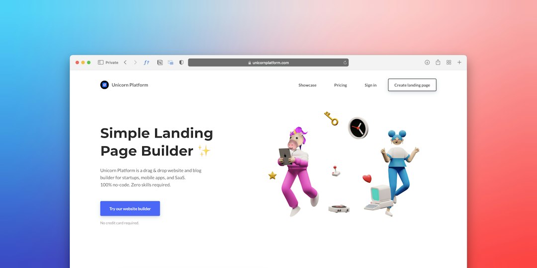
Better landing pages start with sharper references, not a blank screen. Teams need places that show real interface choices, real sections, and real conversion patterns. First impressions can form in about 50 milliseconds, so visual direction matters fast [source: Google Research].
TLDR: Godly UI is useful, but five strong alternatives give designers broader inspiration for SaaS pages, mobile flows, pricing blocks, and clean hero sections. For example, a startup testing three landing page concepts could pull 30 references, build 3 variants, and raise signup clicks from 4.2% to 5.1% after choosing the clearest layout. Mobbin works best for product flows, Land-book for landing pages, Awwwards for bold visuals, Page Flows for user journeys, and SaaSFrame for startup-style sections.
Why teams seek Godly UI alternatives
Godly UI has a strong eye for polished web interfaces. Still, one gallery rarely covers every need. A designer may need a pricing table, a hero section, a mobile onboarding flow, and a checkout screen in the same afternoon. Honestly, it feels like some inspiration sites add three extra clicks before showing anything useful. That gets old fast.
The best design reference tools help teams spot patterns. They do not replace strategy. They speed up taste, structure, and decision-making. A strong reference board can help a landing page feel clear instead of “pretty but vague.”
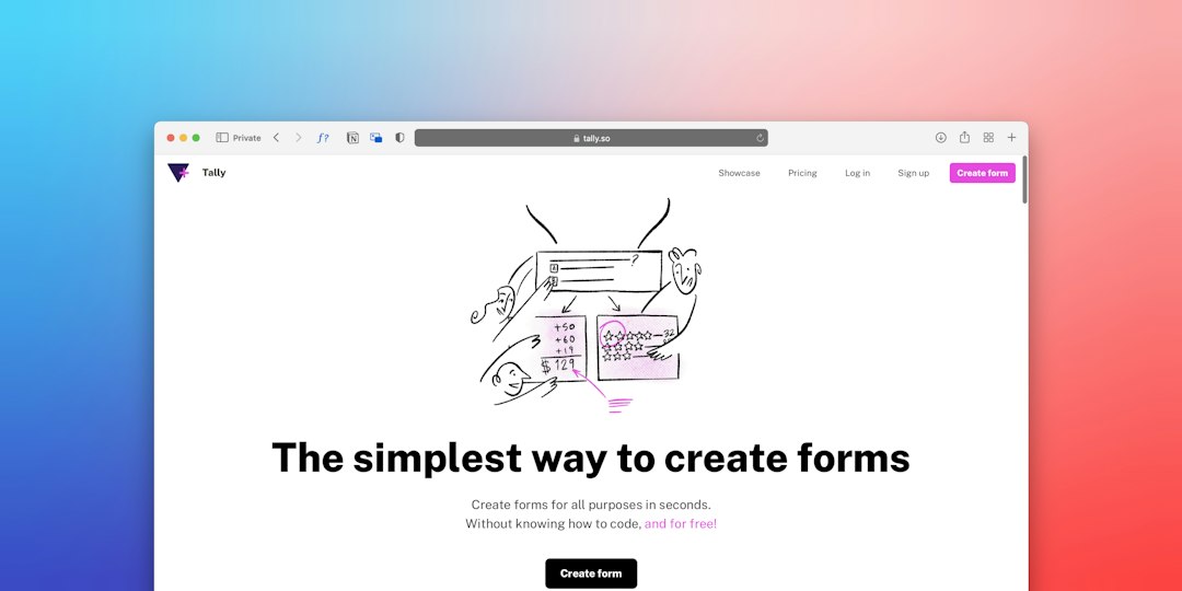
1. Mobbin
Mobbin is one of the best places for modern product interface patterns. It focuses on real app screens from known companies. Designers can study onboarding, dashboards, upgrade prompts, search screens, account settings, and mobile flows.
Its biggest strength is context. A single screenshot is helpful, but a full flow is better. Product teams can see how a user moves from one screen to the next. That makes Mobbin useful for landing pages that connect to a signup or demo flow.
- Best for: SaaS products, mobile apps, onboarding, dashboards.
- Useful pattern: Step-by-step signup screens with fewer distractions.
- Small annoyance: Some filters can feel narrow when searching for niche industries.
2. Land-book
Land-book is a clean source for landing page inspiration. It shows homepages, product pages, portfolios, and startup sites. The value sits in its speed. Designers can scan many layouts quickly and compare hero copy, CTA placement, social proof, and section order.
This makes it a strong choice for teams building better landing pages. A team can collect five hero layouts, three pricing styles, and two testimonial sections before wireframing. That saves time and prevents the usual “make it more modern” feedback loop.
For broader website design inspiration, pairing a landing page gallery with editorial design references can sharpen visual direction even more.
3. Awwwards
Awwwards is still a top reference for high-end web design. It is less practical than Mobbin or Land-book for everyday SaaS work, but it shines when a brand needs impact. Designers go there for bold typography, custom motion, unusual layouts, and strong art direction.
The catch is that not every Awwwards-style site converts well. Some pages look amazing but hide the offer. Others slow down due to heavy visuals. Since the chance of bounce rises by 32% when mobile page load time goes from one to three seconds, speed still matters [source: Google].
- Best for: Visual style, brand sites, portfolios, campaign pages.
- Useful pattern: Large type with simple section breaks.
- Watch out for: Effects that look cool but slow the page.
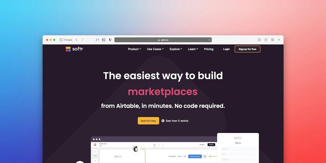
4. Page Flows
Page Flows is built for studying full user journeys. It records how apps and websites handle common tasks. This includes trial signup, cancellation, checkout, account creation, and upgrades.
Landing pages often fail after the CTA click. The hero may be clear, but the next screen asks for too much. Page Flows helps teams avoid that. It shows how leading products reduce friction after the first click.
This is helpful for conversion work. A buyer should not feel dropped into a messy form after clicking “Start free trial.” The message, layout, and next step should all match.
5. SaaSFrame
SaaSFrame focuses on SaaS website sections. It is practical and direct. Designers can study pricing pages, feature blocks, comparison sections, FAQ areas, testimonial rows, and CTAs.
This makes it one of the most useful Godly UI alternatives for startup teams. It helps designers see how actual SaaS companies explain value. The best references are not always the prettiest ones. Sometimes the winning pattern is a plain headline, a product screenshot, three benefits, and one clear button.
- Best for: B2B SaaS, pricing pages, section structure.
- Useful pattern: Problem, product proof, CTA, objection handling.
- Good habit: Save sections by goal, not just by visual style.
Modern interface patterns worth copying carefully
Good references reveal patterns that keep showing up for a reason. Strong landing pages often use a short hero headline, one primary CTA, product visuals, proof near the top, and simple section spacing. They avoid fancy clutter.
Cards, pill filters, sticky CTAs, dark mode sections, split hero layouts, and soft gradients still work when used with restraint. The key is clarity. A visitor should understand the offer in seconds.
FAQ
-
What is the best Godly UI alternative for landing pages?
Land-book is the strongest pick for landing page ideas. SaaSFrame is better for SaaS-specific sections. -
Which tool is best for app interface patterns?
Mobbin is best for product screens, mobile flows, onboarding, and dashboard ideas. -
Can designers copy layouts from these sites?
They should use them as references, not copies. The goal is to study structure, spacing, hierarchy, and flow. -
Which option helps with conversion-focused pages?
SaaSFrame and Page Flows are the most practical. They show how pages support signup, trial, and upgrade actions. -
How many references should a team collect before designing?
A focused set of 15 to 30 examples is usually enough. More than that can slow decisions.