Lucide, Tabler Icons, Phosphor, Radix Icons, Material Symbols, Bootstrap Icons, and Iconoir are the strongest Heroicons alternatives for modern React projects. Heroicons remains simple and clean, with more than 300 MIT licensed SVG icons from the Tailwind CSS team [source: Heroicons], but many teams need broader styles, sharper React support, or larger icon sets.
TLDR: Teams building React dashboards, SaaS tools, and design systems should compare icon libraries by style range, React package quality, bundle size, and license. For example, a product team using 120 interface icons may save hours by choosing Lucide or Phosphor instead of redrawing missing states by hand. If a settings page needs thin icons, filled icons, and duotone warning states, Phosphor can cover that faster. If consistency matters more than variety, Radix Icons may be the safer pick.

1. Lucide
Lucide is one of the easiest Heroicons replacements to suggest. It is a community fork of Feather Icons and keeps the same clean line style. The React package is simple, readable, and friendly for component-based work.
- Best for: SaaS dashboards, admin panels, documentation sites.
- React use: Icons can be imported as components.
- Main benefit: A large set with a calm, consistent look.
The catch is that Lucide can feel too thin in dense mobile screens. Designers may need to adjust stroke width often. Still, for most interface work, it feels close to Heroicons with more range.
2. Tabler Icons
Tabler Icons offers thousands of SVG icons in a simple outline style. It is a strong fit for teams that keep asking, “Why is this icon missing?” That question gets old fast.
Its React support is solid, and icons can be customized with size, stroke, and color props. Tabler works well in apps with many settings, reports, charts, and user actions.
- Best for: Data products, CRM systems, analytics tools.
- Style: Rounded outline icons.
- Weak spot: Some icons look a bit generic at small sizes.
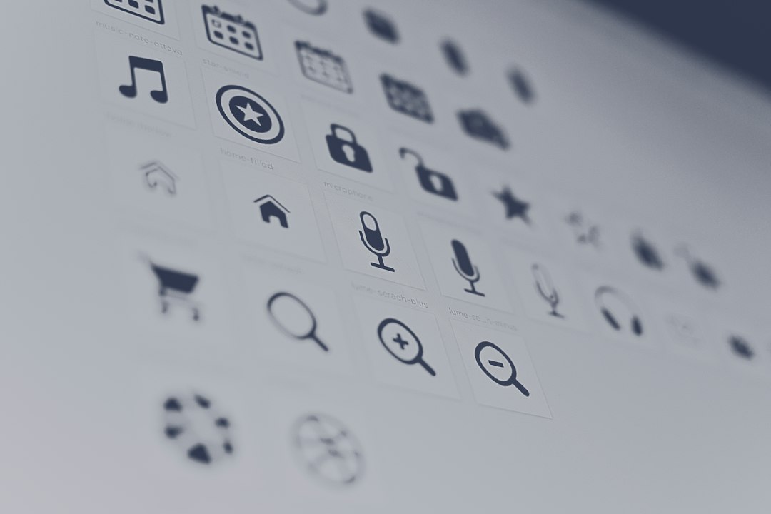
3. Phosphor Icons
Phosphor Icons is a favorite for teams that need more than one weight. It includes thin, light, regular, bold, fill, and duotone styles. That gives designers more control without switching libraries mid-project.
In React apps, Phosphor feels polished. It also helps when an interface needs visual hierarchy. A filled trash icon can mark a destructive action, while a regular one can sit quietly in a table row.
4. Radix Icons
Radix Icons is smaller, but very refined. It pairs well with Radix UI and modern component libraries. The icons are crisp, minimal, and built for product interfaces rather than decoration.
It drives some teams a little mad that the set is not huge. Missing icons can slow a mockup by 10 minutes here and 15 minutes there. Still, the quality is high. For tight design systems, that trade can make sense.
- Best for: Minimal interfaces and component libraries.
- Style: Small, sharp, clean SVG icons.
- Main drawback: Limited icon count.
5. Material Symbols
Material Symbols comes from Google and has a huge icon set with outlined, rounded, sharp, filled, and variable styles. It is useful for apps that follow Material Design or need broad coverage.
The library can feel heavier than Heroicons. Some icons also carry a strong Google-style feel, which may not suit every brand. For Android-like interfaces, though, it fits well.
Teams working on interface design often care about brand tone as much as icon count. Material Symbols works best when that tone already matches the product.
6. Bootstrap Icons
Bootstrap Icons is practical, clear, and easy to use. It is not only for Bootstrap projects. React teams can use the SVG files or community React wrappers.
This set works well for internal tools, forms, tables, and simple web apps. The icons are not as stylish as Phosphor or Iconoir, but they get the job done. Sometimes that is exactly what a sprint needs.
- Best for: Business apps, forms, admin pages.
- Strength: Clear meanings and broad support.
- Weak spot: Less premium visual feel.
7. Iconoir
Iconoir is a stylish open source icon library with a large set and a modern outline style. It feels a bit more expressive than Heroicons. That can help landing pages, creative tools, and polished SaaS products.
Its React package makes setup simple. Icons are also clean enough for buttons, menus, empty states, and onboarding screens. The main risk is style mismatch. Iconoir has personality, so teams should test it beside their typography and UI components before fully switching.
How Teams Should Choose
The best Heroicons alternative depends on the product. A large admin app may need Tabler Icons. A polished consumer app may prefer Phosphor or Iconoir. A strict design system may pick Radix Icons. A plain business tool may be fine with Bootstrap Icons.
React teams should also check tree shaking, TypeScript support, license terms, and import style. A library with 5,000 icons is not helpful if the package adds weight or makes imports messy. Small details matter. A slow icon workflow becomes annoying after the fiftieth screen.
FAQ
What is the best Heroicons alternative for React?
Lucide is often the safest pick. It has a clean style, good React support, and a large icon set.
Which icon library has the most style options?
Phosphor Icons offers several weights, including thin, regular, bold, fill, and duotone.
Are these SVG icon libraries free?
Most of them are free and open source, but teams should still review each license before using icons in commercial projects.
Which alternative is best for minimal interface design?
Radix Icons is a strong choice for minimal UI work. It is small, sharp, and consistent.
Can these libraries replace Heroicons in an existing React app?
Yes. Most can be added through npm and imported as React components. Teams should replace icons in groups to keep the interface consistent.