Choose Mobbin if you need proven product flows from real apps; choose Visualy if you want broader, faster visual inspiration with less friction. That is the cleanest way to think about Visualy vs Mobbin when you are hunting for UI design ideas, screen patterns, onboarding examples, checkout references, or fresh product visuals.
TLDR: Mobbin is stronger for studying polished mobile and web app flows, especially when you need real product screenshots from companies your team already respects. Visualy feels better for quick visual browsing, moodboard-style exploration, and getting unstuck when you do not yet know the exact pattern you want. For example, a product designer redesigning a signup flow might spend 20 minutes in Mobbin comparing 12 real onboarding sequences, while using Visualy for 10 minutes to collect broader layout and style ideas. If your team does weekly design reviews, Mobbin may help with evidence; Visualy may help with speed and creative range.
What each tool is best at
Mobbin is known for its large library of real app screens and UI flows. Designers use it to inspect how popular products handle search, profiles, subscriptions, onboarding, payments, settings, dashboards, and empty states. It is especially useful when a stakeholder asks, “How do other apps solve this?” Mobbin gives you examples that feel practical, not imaginary.
Visualy, by contrast, is more appealing when the task is less defined. You might want a style direction, a landing page feel, a dashboard mood, or a set of UI references before wireframing. It suits early exploration. It also works well when you are collecting visual ideas across categories instead of studying one exact flow step by step.
The main difference: proof versus possibility
Mobbin gives you proof. You can see how a real product presents a permission request, handles a pricing upgrade, or explains a complex feature. That matters when you need to defend a design choice. It is easier to say, “Here are five strong apps using this pattern,” than to argue from taste alone.
Visualy gives you possibility. It helps you collect fresh visuals, compare interface styles, and spark ideas before you lock into a structure. That is valuable when your current design feels flat, but you cannot yet say why. Honestly, it feels like the kind of tool you open when your Figma file has been staring back at you for too long.
Visualy vs Mobbin at a glance
| Category | Visualy | Mobbin |
|---|---|---|
| Best use | Broad UI inspiration and visual direction | Real app screens and complete product flows |
| Strongest moment | Early ideation and moodboarding | Pattern research and competitive references |
| Speed | Fast for freeform browsing | Fast when you know the exact pattern |
| Depth | Varies by source and category | High for product screens and flows |
| Team value | Great for creative exploration | Great for design rationale and examples |
When Visualy is the better choice
Use Visualy when you need inspiration before structure. Maybe you are designing a new analytics dashboard, but the product requirements are still fuzzy. You need a sense of density, card styles, color use, spacing, and hierarchy. You are not ready to inspect a 14-step flow yet.
Visualy is also useful for visual taste calibration. That sounds fancy, but it is simple. You gather references so the team can agree on what “clean,” “premium,” “playful,” or “developer friendly” actually looks like. Without examples, those words cause endless debate.
- Use Visualy for: moodboards, early concepts, landing page ideas, dashboard references, style exploration, and visual direction.
- Use it when: you want breadth more than exact product logic.
- Best fit: solo designers, founders, marketers, and product teams still shaping the brief.
The catch is that broad inspiration can turn into scrolling. If the collection is not organized well, expect to waste time saving pretty screens that do not solve your actual problem. A beautiful card layout is useless if your issue is error handling in a payment form.
When Mobbin is the better choice
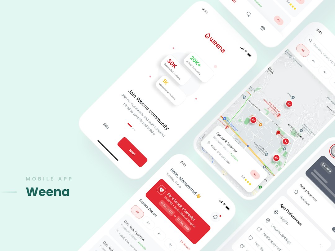
Use Mobbin when you need to study how real products behave. This is where it shines. If you are redesigning onboarding, Mobbin can show how leading apps ask for preferences, request permissions, guide first actions, and move users toward activation. That is practical research.
Mobbin is also strong for product teams with tight timelines. Instead of searching the web and taking random screenshots, you can compare known patterns in one place. It reduces guesswork. It also helps junior designers build pattern literacy faster.
- Use Mobbin for: onboarding flows, checkout flows, subscription screens, settings, account creation, search, filters, profiles, and empty states.
- Use it when: you need examples from real apps, not just attractive concepts.
- Best fit: product designers, UX researchers, design leads, and teams building consumer or SaaS products.
It drives me crazy that even good reference tools can still make small tasks feel slow. For example, if you need only three screens from one flow, but must open several views and inspect each screenshot manually, those extra 30 to 60 seconds add up. Mobbin is useful, but deep research still takes patience.
Quality of inspiration
Mobbin’s quality comes from real products. That means the screens are usually polished, tested, and backed by business goals. You can learn from actual implementation. The tradeoff is that famous apps can start to look similar. If everyone copies the same references, products become dull.
Visualy can feel more open. You may find unusual layouts, fresher art direction, or UI ideas that sit outside mainstream app patterns. That can be a big advantage for brand-heavy products. It is less ideal when you need to know whether a pattern works in a real user flow.
Search and discovery
Mobbin is better when your query is specific. Search for “pricing,” “sign up,” “calendar,” or “notifications,” and you are likely to find useful examples. Its value grows when you already know the component or flow you want to inspect.
Visualy is better when your query is softer. You might search by style, feel, category, or visual theme. This helps when the design problem is emotional as much as functional. A fintech app may need to feel safe. A creator tool may need to feel light and expressive. Visualy can help gather those signals.
Which one should a designer pay for?
If budget allows only one, pick based on your daily work. A product designer working on flows should start with Mobbin. The examples are easier to use in critique, stakeholder meetings, and UX audits. A visual designer, founder, or marketer creating early concepts may get more from Visualy.
For teams, the best setup is often both. Use Visualy at the start of a project to set direction. Then use Mobbin to validate interaction patterns. A simple workflow looks like this:
- Collect 20 to 30 broad references in Visualy.
- Group them by tone, layout, density, and color.
- Pick one or two visual directions.
- Check Mobbin for real flows that match the product task.
- Design with both mood and function in mind.

Final verdict
Visualy is better for creative breadth. Mobbin is better for product depth. That is the real decision. If you are stuck on how something should look, Visualy can loosen up your thinking. If you are stuck on how something should work, Mobbin is the safer bet.
For serious UI design inspiration, do not treat either tool as a place to copy from. Treat them as research inputs. Save patterns, ask why they work, then adapt them to your product, users, and constraints. That is where the real design value shows up.